I got into box making when I saw there were repro boxes on the Internet. I wanted some for my loose figures and when the repro boxes finally came in, it was a let down to say the least. They were dull color copies of faded, sometimes beaten up boxes mounted to board.
So, I started to do my own, beginning with the Mad Monster boxes. I made sure what I made for myself and others was intensely colorful, crisp and bright. I always aim for the charge up your spine feeling you had when you caught sight of that package of a desired action figure in a 1970s department, toy or drug store.
I soon got requests for custom boxes, plus there was some thing I wanted to do a custom of myself. Also, I like boxes more than cards and wanted to have an authentic looking box to put figures Mego had on card only.
My first custom box project was for the original six Star Trek figures. It was meant to go with the existing Planet Of The Apes figure boxes. I had always felt Star Trek got a little shafted because they came out a bit later than Apes and only got a carded bubble package and Apes both boxes and cards.
I had only seen pictures of the Ape boxes and from the look of them assumed they were the size of Wizard Of Oz boxes, which I did have. So my first Star Trek boxes were the same size as Wizard Of Oz boxes (as was the Space:1999 ones I made).
Later, thanks to Scott Arendsen, I was able to borrow Planet Of The Apes Astronaut box and soon rebuilt the Star Trek boxes to be the same size (and, of course Space:1999 too).
Sometimes a person making a request wants an updated, modern looking custom box and I go with what that person wants.
However, the best fun is making custom fantasy packaging that is retro and as much as possible looks like a lost piece from the 1970s.
Its doing those boxes that I can create new versions of what I find charming in old toy packaging and what it lacks today.
Todays toy packaging (rightly so) is made with the awareness that there are adult collectors. It is made with key art and layout tightly controlled by the licenser usually for accuracy and to meet approval of talent.
It leaves little in the way of spontaneity, little in the way of flight of fancy and color (both literally and figuratively) in todays packaging. Its quite homogenized.
60s and 70s toy packaging, on the other hand, was loosely controlled. A Star Trek package from Azark Hamway would look totally different from a Mego Star Trek package.
Artists took liberties in doing art for the property, looking often radically different from how things looked in the show or movie. It was a new look at something familiar for a kid and imagination filled in the gaps as to why, say, the Klingon on the Star Trek card doesnt look like the Klingon figure it holds or doesnt look like any Klingon in Star Trek.
60s and 70s toy packaging was full of color. Kids are attracted to color. The best packaging had splashy bold illustrations that called out to your imagination. The illustrations usually had texture and complexity but still had a bit of roughness and vagueness to it (Grey Morrows Mad Monster art for example).
Retro packaging is much more fun.
So, here is the gallery of my box and card efforts (most in the retro style I love). Most of what you will see are digital mock ups and not pictures of an actual box or card. Often times, when I make a box for somebody, I send it out before I have a chance to take good pictures of it.
You will also see the few customs I have done. Usually made possible by a wonderful custom head being out there somewhere.
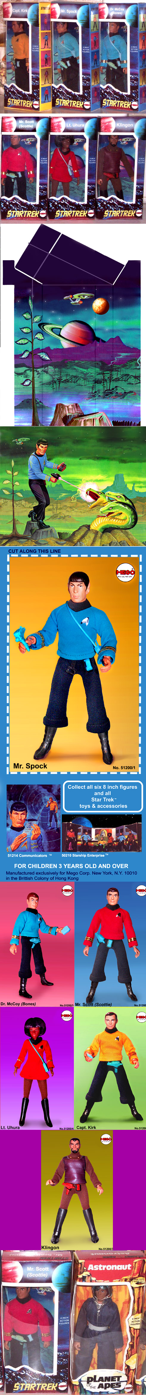
The Star Trek boxes were the first big project. Made to go side by side with the actual Planet Of The Apes boxes Mego released for four ape characters.
The insert was put together from a few elements, but the main element was from my favorite Star Trek toy art. Well, actually it was for the Mr. Spock model kit, which may or may not be a toy. I used the rocks, Enterprise, tree and the background rearranged and re-colored with a couple planets and made the ground beyond the rocks into a misty swamp.
I took pictures of the six figures but they were on type 2 bodies and I wanted everyone on type 1. So, instead of popping heads on my one type 2 Trek body I just dressed the type 1 Kirk I had as every character and put the proper head on in Photoshop.
I wanted it to look like they were prototypes so a look at the Trek figures commercial shows that all the crew figures had thicker black collars and somewhat looser fitting shirts. Also, McCoy was seen holding a strapless tricorder piece.
So I thickened up the collars and subtly loosened up the sleeves and had McCoy (actually T1 Kirk) hold the Tricorder in his hand (with the help of a little poster tack). I painted out the strap.
The clothing, accessories and faces were all worked on separately to enhance them as well as the boots. They got enhanced to shine.
Finally, they got a digital color background resembling the background Mego pictured many of their figures against.
The front art was taken from a picture of a Matte painting of the moon from Destination Moon photographed off the TV from a DVD freeze frame.
The movie was from 1950 and so their version of the moon looks nothing like the real one. It was instead, a fantastic alien landscape.
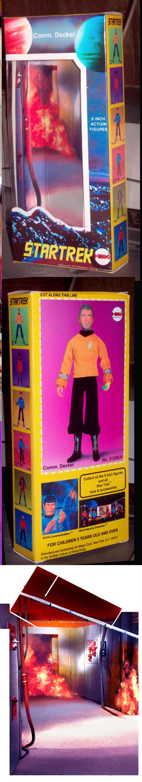
I was asked to do a box for Captain Dunsels wonderful Commodore Decker (from the Star Trek episode The Doomsday Machine) head worked into a great figure. I was able to find a good photo of the trashed corridor from Deckers Constellation from the Star Trek episode for the insert. I wanted to make it look like it was during the planet killer attack so I added fire.
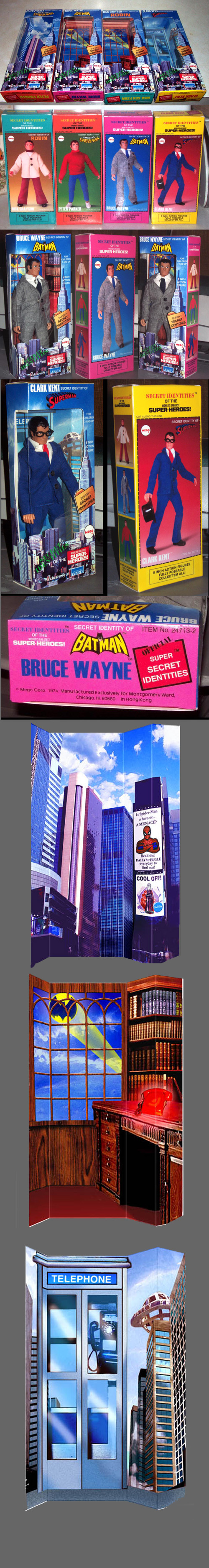
What if Montgomery Wards did their exclusive Secret Identities up as store exclusives instead of Catalog exclusives? What if Mego went all out in the packaging department similar to the packaging for the Knights and Robin Hood? Well, this is what it might look like. Much thanks again to Scott Arendsen for letting me borrow his real Dick Grayson for photographing.
The hardest part of this was finding a picture of a good old-fashioned telephone booth for Clarks insert.
I made sure to include the Manufactured exclusively for Montgomery Wards designation that was found on the Dr. Kromedome package.
I wanted to do a separate insert for Dick Grayson but just couldnt think of something that would be substantially separate from Bruce. Anyway, they are the Dynamic Duo and can share the same insert just fine.
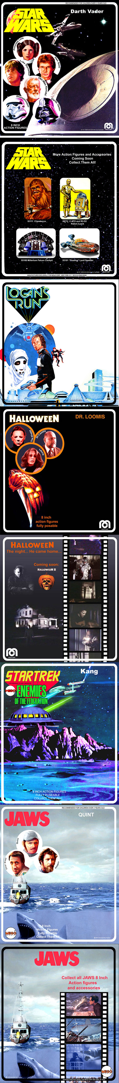
Heres a bit of TV/Movie card designs of stuff we wish Mego made. On top of the list is, of course, Star Wars. Even though Mego pretty much phased out the cameo circles on backer cards by 1976, I would think they wouldve brought it back for Star Wars to show what characters were there. On the back of the card is a fantasy Millennium Falcon playset and other extensions of the line. Only the front is done so far on this Logans Run movie card. Ill finish it off someday. Main art came from a Cinemafantastique cover but a lot of re-coloring was done.
One of my first requests was for a Halloween card. Its simple but does the job.
This is a fantasy Mego idea of right after the original Star Trek figures, Mego made a Enemies Of The Federation series. The art idea has the Enterprise in battle with some enemy planetary base. Film buffs will recognize that the alien base is really the Morbius house from Forbidden Planet, only its a different color and quite elevated from the ground. Ive seen a few examples in toy art where you can see where the artist used recognizable things from other movies altered and changed around. I wanted it to be in that spirit and be a little homage as well.
Oh boy, how cool would it have been if Mego did JAWS figures? It wasnt as if people werent making JAWS toys. I bet the reluctance to do JAWS figures stemmed from the thinking that Quint, Brody and Hooper were not the stars of the show, Bruce the Shark was.
The front art came from photographing the JAWS Orca model ship diorama that Macfarlane Toys put out a few years ago. I put the little Quint figure at the steering wheel. Put it all together with a gray sky, water and a picture of the JAWS shark underneath (from the laserdisc set). I worked on it all to integrate it and make it look more like an illustration. Look at Bruce the Shark sneaking up on the Mego logo!
The filmstrip on the back of the card is made up of composites to represent moments in the film but not do it through well-worn production stills everyone has seen. Something I might change or make an alternate version of is the Shark eating Quint picture in the filmstrip(also gleaned from the Macfarline diorama). I liked it at the time but it would not have made it to a toy package in 1975 because of the violence of it so it makes it less realistic. Its not a big deal to paint out Quint and just make it a Shark lunging up on the stern of the Orca.
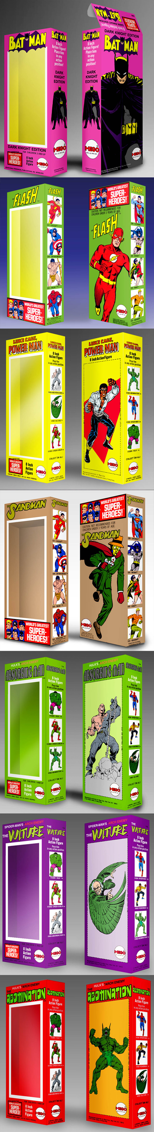
Heres the additional characters added to the Worlds Greatest Superheroes
Dark Knight Batman
The Flash
Luke Cage: Power Man (the person requesting the box wanted his usually yellow shirt to be white. So a white shirt was made as an overlay while the usual yellow shirt is available underneath in the art)
The Sandman
Absorbing Man
The Vulture
The Abomination
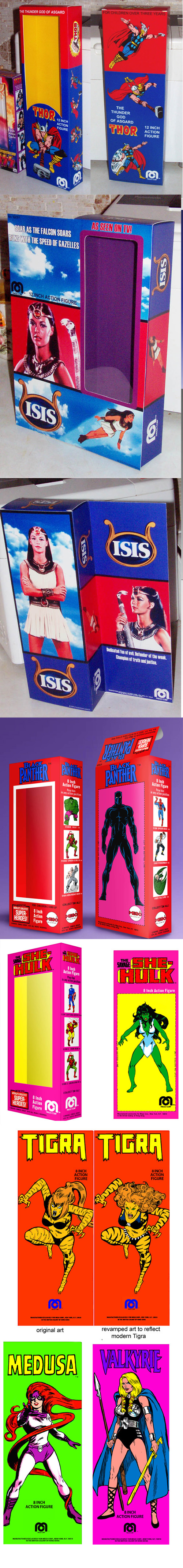
12 inch Thor (box it about 14 inches tall to accommodate the head dress)
12 inch Isis
Black Panther
She Hulk, which is part of the series with Tigra (which had two versions, retro and modern)
Medusa
Valkyrie
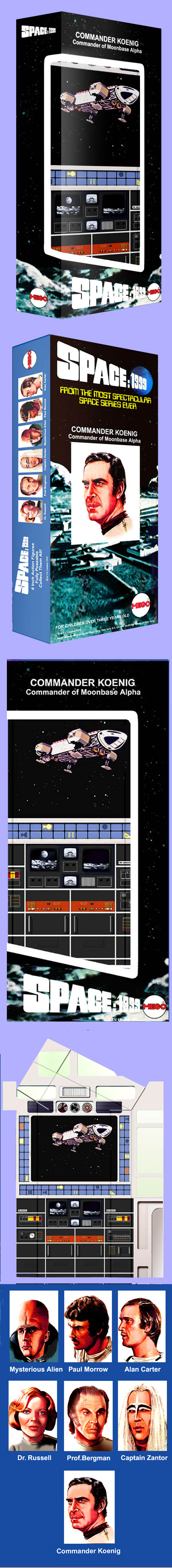
For Space:1999 it was a matter of rearranging the card art, adding Professor Bergman and Dr. Russell and making an insert of the Main Mission control room. The Eagle on the screen comes from the Space:1999 lunch box. It took a while to get Dr. Russell and Bergman looking like they fit in with the existing cameo art.
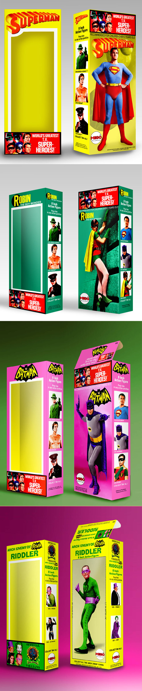
Someone requested a Hero style box a group of TV Heroes, complete with a Worlds Greatest TV hero logo. A style was settled on that had the hero on back with a background represented but only in the color of the box. Superman has the space and planets view in yellow tone, Robin is climbing a green tone wall and Batman just has a pink background with some apparent depth. Building a TV style Superman logo from the comic one was the toughest thing to pull off.
Also wanted was a series of boxes for the Batman Villains with the United Underground logo and in the general look of the real Arch Enemy boxes.
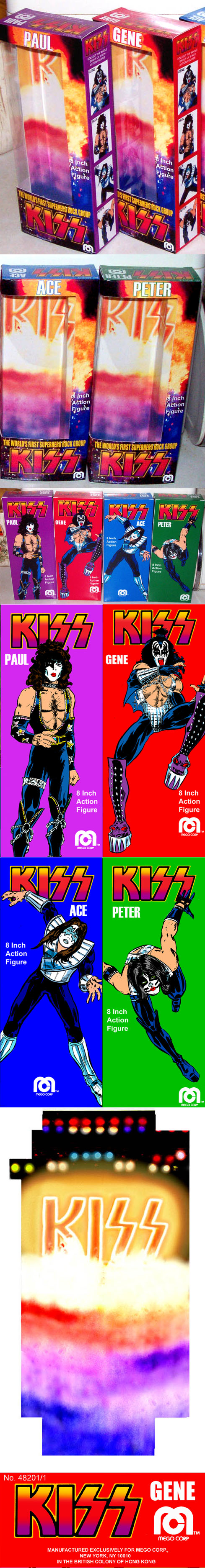
When I got the chance to do KISS boxes I was excited. As much as I like the 12 KISS figures I wished they were 8. Also, after the 2 KISS comics and the Superhero KISS TV movie (KISS Meets The Phantom) KISS had a fantasy persona as well as a musical one. The Mego box totally ignores the fantasy persona. I wanted the fantasy version of KISS in these boxes with a nod to their music persona.
Although they were done in the size of the Robin Hood boxes, on the back I wanted it to evoke the Hero boxes. Hence, the comic art over the solid color. The art was pieced together from the Marvel art. The only one that had a good image off the bat without need for modifying was Paul.
The insert art was made from a picture of KISS on stage with added fog and a lot of work done to the KISS logo to give it a fantasy edge.
The item number 48201 is the zip code of Detroit, Rock City.
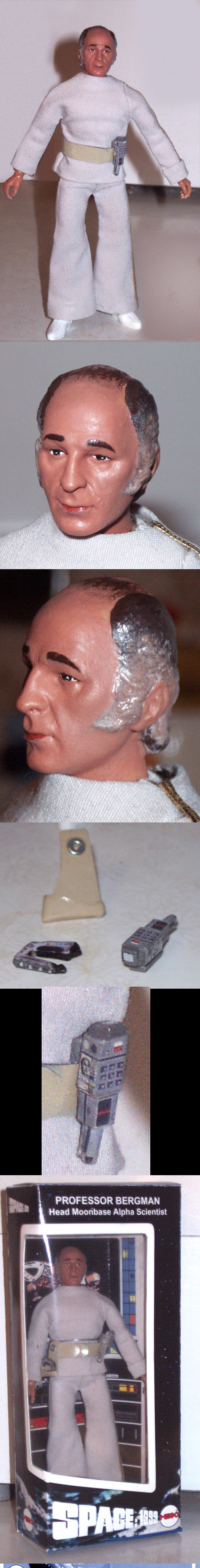
The first of my wish fulfillment customs was Professor Bergman from Space:1999. It all came together from someone offering a shrunken Mattel Bergman head. I got into casting heads myself for a time and actually did a little extra work on the casting of the Mattel head (sculpted a little more definition to the edge of his bald line) to make a modified heads from it. I painted the head as best as I could.
The clothing was hand sewn or glue stitched. The gold trim was glued down. The accessories were a Doc Mego cast Mattel stunner painted. The commlock was made from styrene rods and sticks, carved a bit and finished off with paint and decals (even with a little picture of Bergman on the ID). The belt was made from painted soft vinyl. The holster was made from a thinner vinyl cut from a pattern I made with a washer glued to the top.
It all came together in an early version of the Space:1999 box (Wizard Of Oz size).

The second wish fulfillment custom was the Boris Karloff Frankenstein. When I got the Mummy back in the day, I was so hot to trot over the idea of getting a Mego Frankenstein. But he was nowhere to be found when I was a kid. In my minds eye I had an idea of Mego Frankie looking like the movie one.
It wasnt until I became a collector that I got a Mego Frankenstein and saw he was a generic version. Although, I love Mego Frank, I always wanted a movie style Mego Frankenstein.
The chance came when master monster figure customizer Mathew Jaycox let me have a couple extra Sideshow Toys Frankenstein heads. He even mounted a Mego neck plug in one of them.
What also happened was Classic TV Toys and their release of The Munster Figures. Herman Munster had the clothing and the body I needed for Frankie.
I did dye the jacket and pants to be darker then they were before though. Also, since the Classic TV Toy body is a bit smaller then a Mego body, I put tissue in his boots to serve as a lift to make him taller. I also padded the shoulders under the gray shirt to make them broader (hey, Mego mightve done it!).
I painted the head in the style I think it wouldve been done in the 70s. I finished him off in one of my Movie Monster series boxes.

Yes, the movie monster boxes. Ive only carried Frankenstein and a request of Phantom Of The Opera through to completion so far. But have made little cameos of the rest of the big monsters to go with them.
I did do a Sea Creature box in the window Mad Monster box style. It had two styles of head, a more generic version and the movie version (shown). I might someday carry over the movie version to the Movie Monster series boxes. I already have some insert art set up for the Creature.
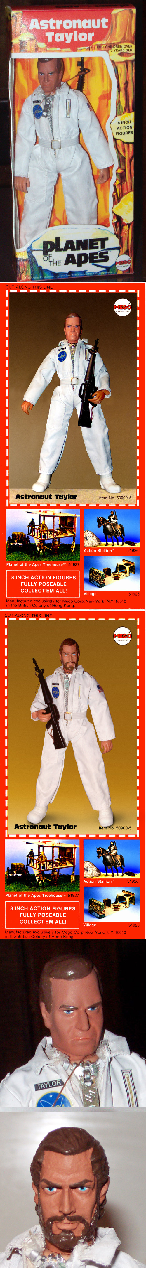
My third wish fulfillment custom was Chuck Hestons Taylor from Planet Of The Apes. I liked Planet of The Apes as a kid but I liked Star Trek more. Since I had limited toy lobbying power with the folks I usually went for Star Trek stuff, even though some of the Ape stuff looked mighty nice too. But I thought there was a Chuck Heston Taylor figure out there and if I found it in a store I wouldnt leave without it.
It wasnt until I became a collector that I learned there was never a Taylor figure, only a generic astronaut.
So when the heads became available, I got them and proceeded to bleach an extra Astronaut outfit white (I ended up painting it white).
I got the bearded head first but had it in my head that if Mego did do Heston, they would do him clean shaven, so I got the clean shaven head.
Add on a belt of elastic fabric with a metal buckle from a AJ outfit, stickers I whipped up and a riffle and I think it got pretty close to what Mego wouldve done if they went the extra distance to get Hestons likeness.
I made a bearded and non-bearded box for Taylor too, taking the place of the Generic Astronaut.
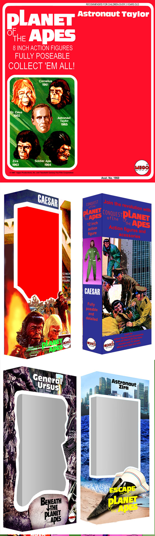
I also made card art for Taylor (only clean shaven so far). Also, here are the boxes made for other Planet Of The Apes movies. The Conquest one was for a 12 inch figure. The Beneath and Escape boxes were made to go with the original Apes box, of course.
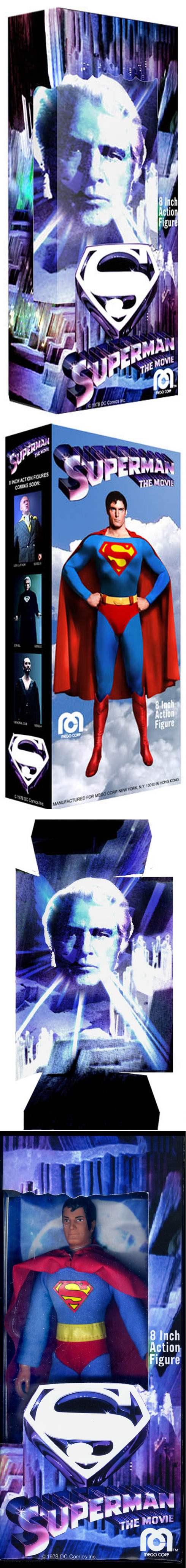
The Superman movie just box had to happen someday. Christopher Reeve personified Superman for us Gen Xers, even more so when he had the unfortunate twist of fate, which paralyzed him. I wanted the box to be a bit special. It was made in the larger Wizard Of Oz style because I thought it should be a bit bigger than normal. The Jor-El face on the insert serves as a surprise when you lift the figure off. Someday there will be a good Christopher Reeve head out there I can get to put together a good custom for this box. The stock number is 92552, 9/25/52 is Christopher Reeves birthday.
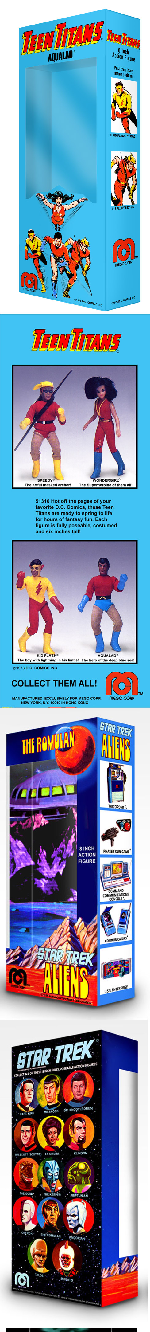
The Teen Titan and Star Trek Alien boxes are a fairly straightforward rearranging of the card art. I got the picture of the Teen Titans from a copy of a page in a Mego Catalog. For the Trek Alien insert, I used the art I put together for the Enemies of The Federation card.